RE:Pair
The Expert Pairing App
Talk to an expert in virtually any field, instantly.

The Problem:
My Role:
People don't always get exact answers to their questions.
User Story:
As a user, I would like to show an expert the problem, so that I won't spend a long time on the phone describing it.
Context:
This design was created under the supervision of two professional UX designers from CareerFoundry.com for the purposes of attaining a UX Immersion Certificate and to create this portfolio. All designs in this theme were created by me, Ben. Nice to meet ya!
UX Designer/UI Designer
Competitive Analysis
User Research
User Testing
Wireframing
Prototyping
Many Iterations
Accessibility Testing
Tools:
Sketch | Balsamiq | Adobe XD | Google Drawings | UsabilityHub | Invision | Craft | W3Schools | Optimal Workshop
So...You Want to Hear a Story?
It all starts with a little research
Research Goals:
-
Determine user pain points when working through an issue with a technician over the phone.
-
Attain a detailed description of their ideal situation when working through an issue with an expert.
-
Discover how often users for see themselves using a service like RE:Pair


Three Participants answered my questions
Some pain point users have with experts over the phone was having to jump through hoops to talk to an expert and also being put on hold. Users said they would get help with their issue eventually, but it would take a long time. User's also mentioned that exact answers to their questions were not addressed until deep into the conversation, because users must explain the entire story first. Finally users saw themselves using an app like RE:Pair about six times in a year or every other month.

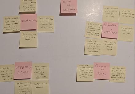
Multiple Rounds of Affinity Mapping
Most people are visual learners and therefore would appreciate an expert who shares a drawing or visual aid is preferable. Users want to spend as little time as possible dealing with an issue. People seem to get frustrated if it takes more than 20 minutes. That's the trend I noticed when conducting the interviews.

User Personas Were Born
Each persona was used to serve a different purpose.
-
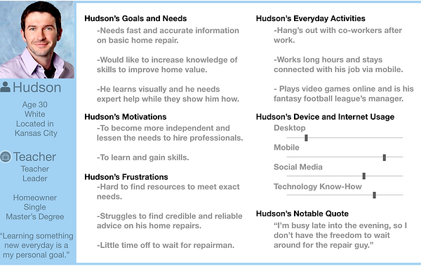
Hudson is a teacher and he represents our average user, because he's constantly busy.
-
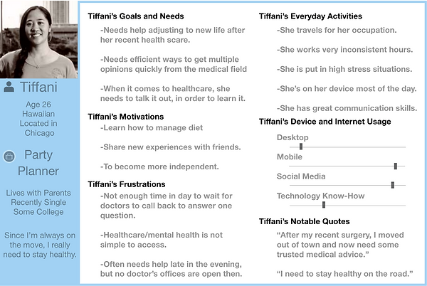
Tiffani is a beginner. She's travels for her work therefore she needs help making healthy choices.
-
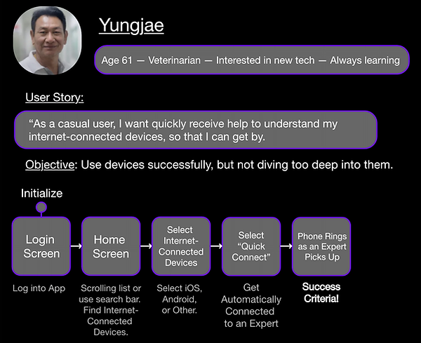
Yungjae is our occasional user and doesn't need the most thorough answer. He just needs enough information to get by.
Meet Hudson: Our Teacher
Meet Tiffani:
Our Social Butterfly
Meet Yungjae: Our Dad

These Personas lead us to create User Flows...
Hudson User Flow 1:
Hudson's our teacher, so he is handy with technology, but he's often busy in the evening. He doesn't have time to learn new trades. So, he needs a little help. He's a visual learner, like most of us and he likes seeing the problem and solution.
Success Criteria:
Checking his inbox for images and visual aids.


Hudson User Flow 2:
Hudson is a homeowner and to get help with his home repairs, he needs to schedule ahead. I decided that Hudson needs the functionality in the RE:Pair app to choose a time and date while also ensuring a specific expert is available at that time. (This is partly where the name came from: to "Pair up" with and Expert)
Success Criteria:
Speak with an Expert
(That's the whole point of the app)
Yungjae User Flow:
Even though Yungjae is a high-level veterinarian, that doesn't mean he is a high-level user. He represents our casual or occasional user. He needs an answer to his questions, but he is not necessarily in need of the most credible or award winning experts in the business. Yungjae simply wants a little help so he can get by and that's about it.
Success Criteria:
Get connected with any expert quickly and there's no need to check credentials.
The Birth of RE:Pair
Early Wireframes
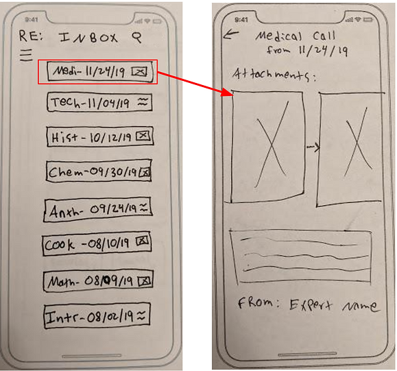
Low Fidelity Wireframes on Paper
I started creating wireframes for RE:Pair with then idea of getting topics and experts to users right away. Therefore the home screen is the topic list. After a topic is selected then it shows experts in that field. The expert profile started out as a bulleted list, but this changes later on. Notice how the search function is not present on every screen? This was fixed in a later iteration.


Medium Fidelity Wireframes
The process of wireframing was quite the task, but RE:Pair became real at that point. I learned the important parts behind spacing items on a page, the importance of white space, and how industry trends really did look best on my design. I tried a few experimental ways to organize my screen, but felt like it was wrong and settled with what you see here. The biggest learning came with the user flows as I tried to create the simplest way to complete a task. As I dug deeper, I realized the user has expectations of how things are supposed to done. The realization that I should use their preconceived notions about applications was really the turning point in my understanding of how to design screens in the future.


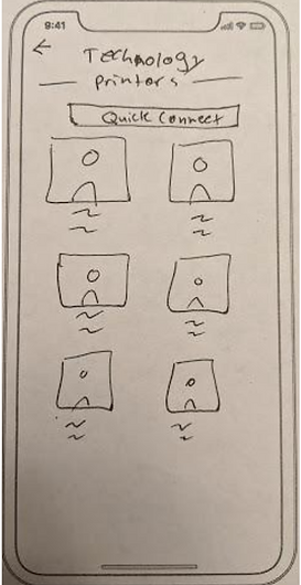
Quick Connect User Flow:
1. Select Topic
2. Hit Quick Connect
3. Confirm
This user flow used to have 4 steps, but once I placed Quick Connect inside a topic list, it made the process that much easier.
High Fidelity Wireframing
Wireframes made using Sketch
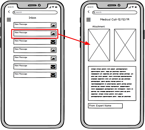
The high fidelity mockups were the most fun to create because all the work and learning I've put in to creating personas, creating their stories, and problems made the process on satisfying a need that much more rewarding. The major changes with this iteration was the added images, the menu switched sides, and labels. I realized that the back button and the menu button should stay away from each other in order to avoid mistakes. I also want you to notice on this home screen that the topics are off center. This has been fixed in the current iteration.


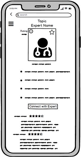
Expert's Profile Screens
-
Larger Centered Picture
-
Name and Profession
-
List of Credentials
-
Expert Rating
-
Call or Schedule button
-
Reviews
-
All Centered
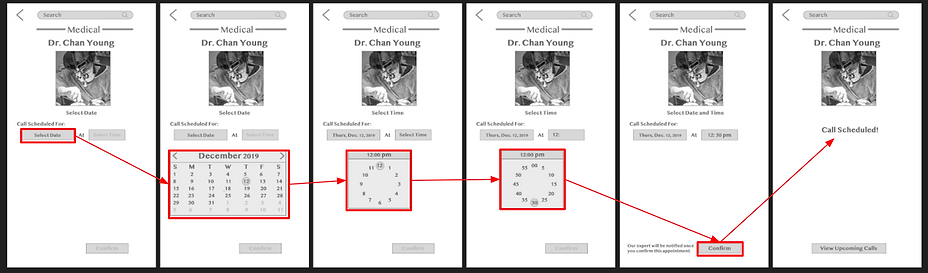
Schedule a Call with an Expert Screens
Finally, Let's Put it to the Test
Testing Objectives
-
Onboarding - Determine if users learn enough of the app by going through a short onboarding section.
-
Making a Call - Find out if participants can make a video call to an expert.
-
Scheduling a Call - Discover if users know how to schedule a call with an expert in the future, by selecting date and time.
-
Check Messages and Reply - See if participants know how to look through the inbox, find unread messages, read and reply to an expert’s message.

Usability Test Plan
Introduction:
I conducted six usability tests to potential users and asked them to complete multiple tasks. Each test session took about 20 minutes long. Users were allowed to ask questions about the application and explore the entire app.
Methodology:
Four tests were moderated as in-person conversations
2 were remote moderated.
All six users completed all tasks, the main issues that the participants faced are listed below.
Issue 1: Expert list screen has only pictures and no real information (High Priority)
Suggested Change: Add in Name, years of experience, and rating.
Issue 2: Users did not know what their screen was intending to show them (High Priority)
Suggested Change: Add Labels to inform users of their location, also add pictures to the Menu.
Issue 3: Users struggle to figure out if specific expert can help them or not.
Suggested Change: Add expertise into the expert list view.
Script:
For a detailed look at the Test Script, including a list of all tasks tested, feel free to explore the complete script:
Issue 4: Could not check messages because he was looking for “Messages” not “Inbox” (Medium Priority)
Suggested Change: add an envelope image to the messages sections to draw user’s attention.
Issue 5: User could not figure out how to save an expert (Low Priority)
Suggested Change: Add Label next to the Star button on Expert’s Profile Page.
The Final Product


Video Introduction of RE:Pair
Under 3 minutes of video showing the main functions of the application with voice-over by the designer. Enjoy!
Go check out the Prototype
The Current
RE:Pair Prototype
All Navigation is through the menu on the top right
Once you navigate through the onboarding process try out the following tasks.
Tasks:
1. Find Medical Expert
2. Schedule a Call
3. Check your Messages
4. Use Quick Connect
5. Check out your profile
Let me know what you think!